Visualizing the Data of Culture Challenge
Can culture numbers teach us about the creative sector?
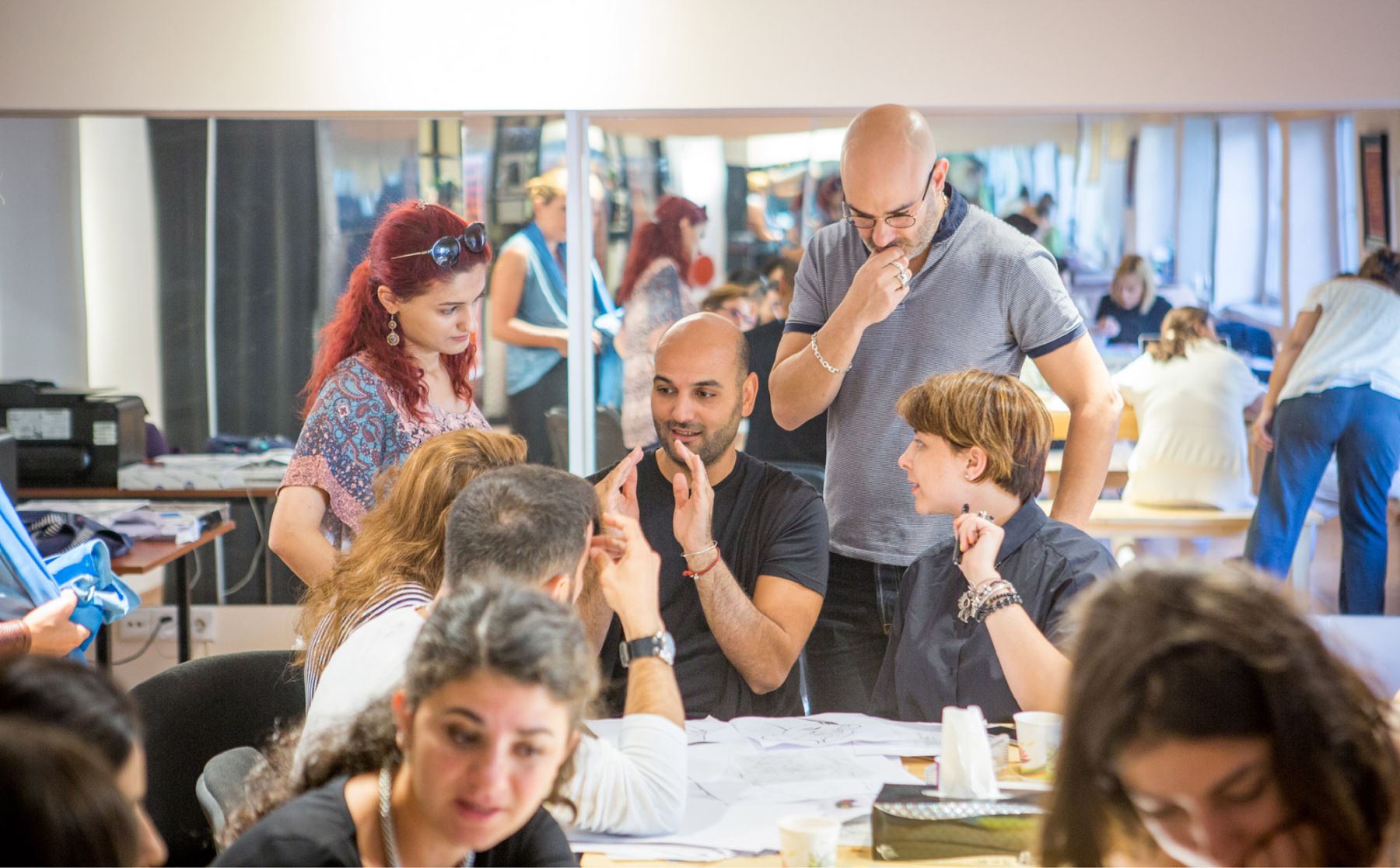
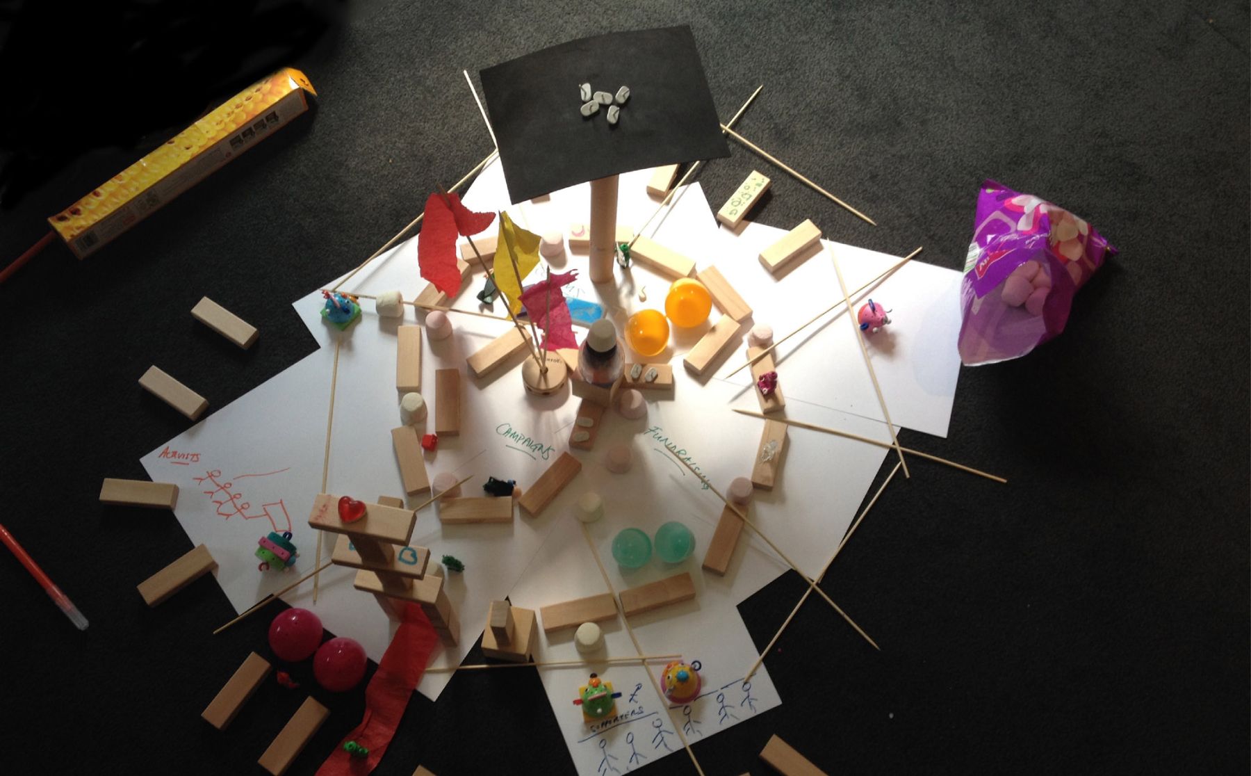
The King Abdulaziz Center for World Culture (Ithra) is hosting Visualizing the Data of Culture as one of the Tanween creative challenges in cooperation with the College of Design at Imam Abdulrahman Bin Faisal University (IAU). The event is taking place from August 31 to September 20, 2020. IAU graphic design and multimedia students are challenged to represent data by creating infographics such as interactive posters, models and videos that tell the story of cultural activity in Saudi Arabia. The best designs will be exhibited in the Idea Lab during the Tanween season.
TheVisualizing the Data of Culture challenge will shed light on the Kingdom’s cultural sector by analyzing its present status and future trajectory using scientific methods based on data analysis and visual interpretation. This will provide an opportunity for participants to enhance their design and complex data-processing skills by creating compelling visuals that communicate effectively to the average person. This challenge will provide participants with experience that will help them produce professional-grade works for publication and exhibition. The event will help provide a forward-looking vision which could open up new horizons for the future of the Saudi culture sector.
There is no doubt that data and its communication are becoming more important by the day, in light of the information revolution that the world is experiencing. Institutions that do not rely on data have essentially chosen to sit on the sidelines while others lead the way. Data harvesting, statistical analysis and interpretation are all now pillars of information science. As the reliance on data shifts from the realm of the experts to a key component of public consumption, the presentation of data, or rather, presenting its interpretations, is growing in importance. The graphic representation of data, or infographics, has become a critical communication skill, particularly when it comes to sharing large amounts of information with a public that is not expert in statistical analysis.
Now less willing to rely on the opinions of experts, the general public has come to expect data as a tool for growing collective awareness in line with major social and cultural outlines. In this context, the importance of combining design with data science is evident. On one hand, data visualization is a form of visual art that combines the traditional elements of graphic design, such as shape, color, and lines. On the other hand, it is a form of journalism as it is tasked with accurately representing the facts of data in a context of meaning, of interpretation.
Ithra’s Visualizing the Data of Culture challenge seeks to trace the Saudi cultural sector’s path from the present to an image of the future through the visual interpretation of the works exhibited at the Idea Lab. The fundamental question posed in the work is how much can present-day data tell us about the future? What are the trends? How clear are they? Where are the areas of growth in the cultural sector? And, finally, how much can excellent design help us learn more from the data by seeing it better?
Data mining turns us into detectives. Data are facts, but it is up to us to decipher them and find the proper path forward from their clues and directions. This is why insight, understanding and excellence on the part of graphic designers can help us all be better consumers of data and better learners. And if what we are investigating is the path forward for culture in the Kingdom, then excellence in data presentation helps us better understand the future of the creative sector and the Saudi institutions that support culture and the arts.